You might have noticed a few changes around here. I felt like the site needed a fresh look, so with Joey’s assitance, mox & fodder got a little makeover. Keep reading for a breakdown of the changes.
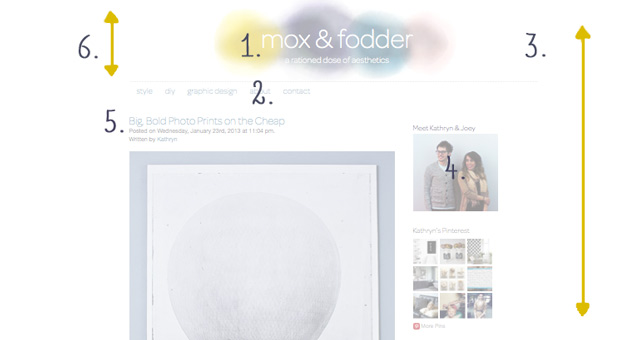
1. The header got a facelift courtesy of Joey. He used Paper (my favorite iPad app) to create a watercolor that complements our hands on style.
2. The font color was changed to match the blue in the watercolor header.
3. The background pattern was removed, leaving just white space. I think this makes the site look cleaner and more spacious.
4. We updated our photo on the sidebar.
5. We changed the font of all titles to Omnis-Pro.
6. The header’s height was shortened to reduce it’s emphasis. We want the content of our sight to be the first thing a visitor notices, not the header.
There will probably be some additional changes over the next few months as we continue to tweak the layout and appearance of mox & fodder. If you have any suggestions for how we can improve the site, we welcome you to leave a comment below.