I have a friend that used Modsy to help her redecorate her living room and it looked so amazing. So when they were having a 4th of July sale, I decided to jump on it and try out the service for my bedroom. For those of you who don’t know what Modsy is, it’s basically a digital interior design service. You upload a bunch of photos of the room you need help with, take a few measurements and fill out a style survey. Then an interior designer gets to to work and the magic happens. The end product is a few different 3D mockups that are fairly photo-realistic. It’s a super cool service. If there is anything you don’t like, you can change out products yourself or you can have a redesign from the interior designer. I bought the cheapest package, the Classic. The more expensive packages get you a dedicated designer, but I didn’t feel the need for that.
So what’s my overall rating? Drumroll please…. I’d give it a solid B. I wasn’t overly into any of the designs and I don’t think they really got my style, but I love the idea of the service and the fact that I could play around and make my own designs. It’s a little clunky and time consuming to switch design elements out, but it’s still a really great feature. They even have a 3D mockup where you can move pieces of furniture around. But I think my favorite piece was the virtual reality feature where you can stand the room you are redecorating, and point your phone in different directions to see what that area would look like. Pretty cool!
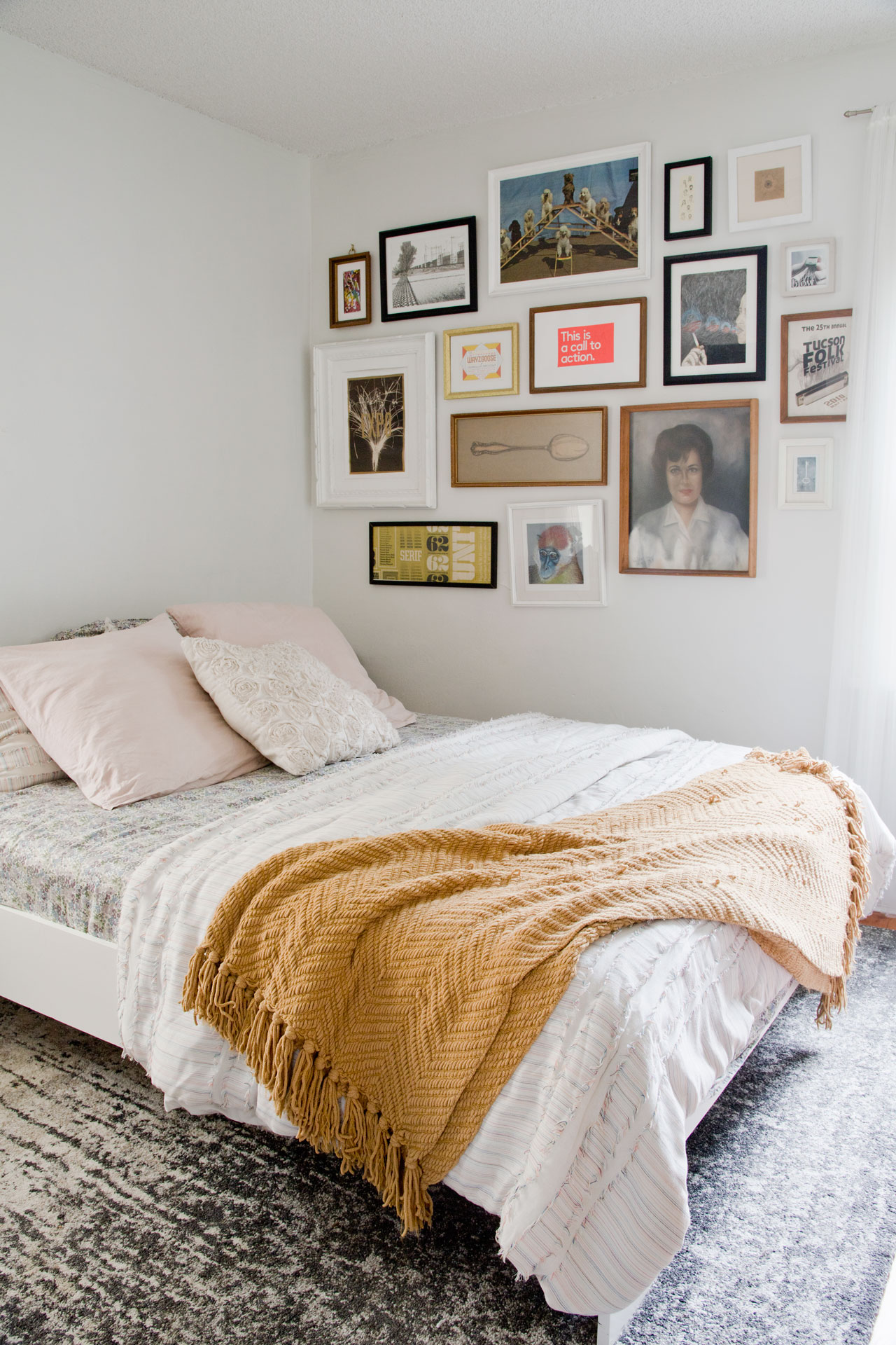
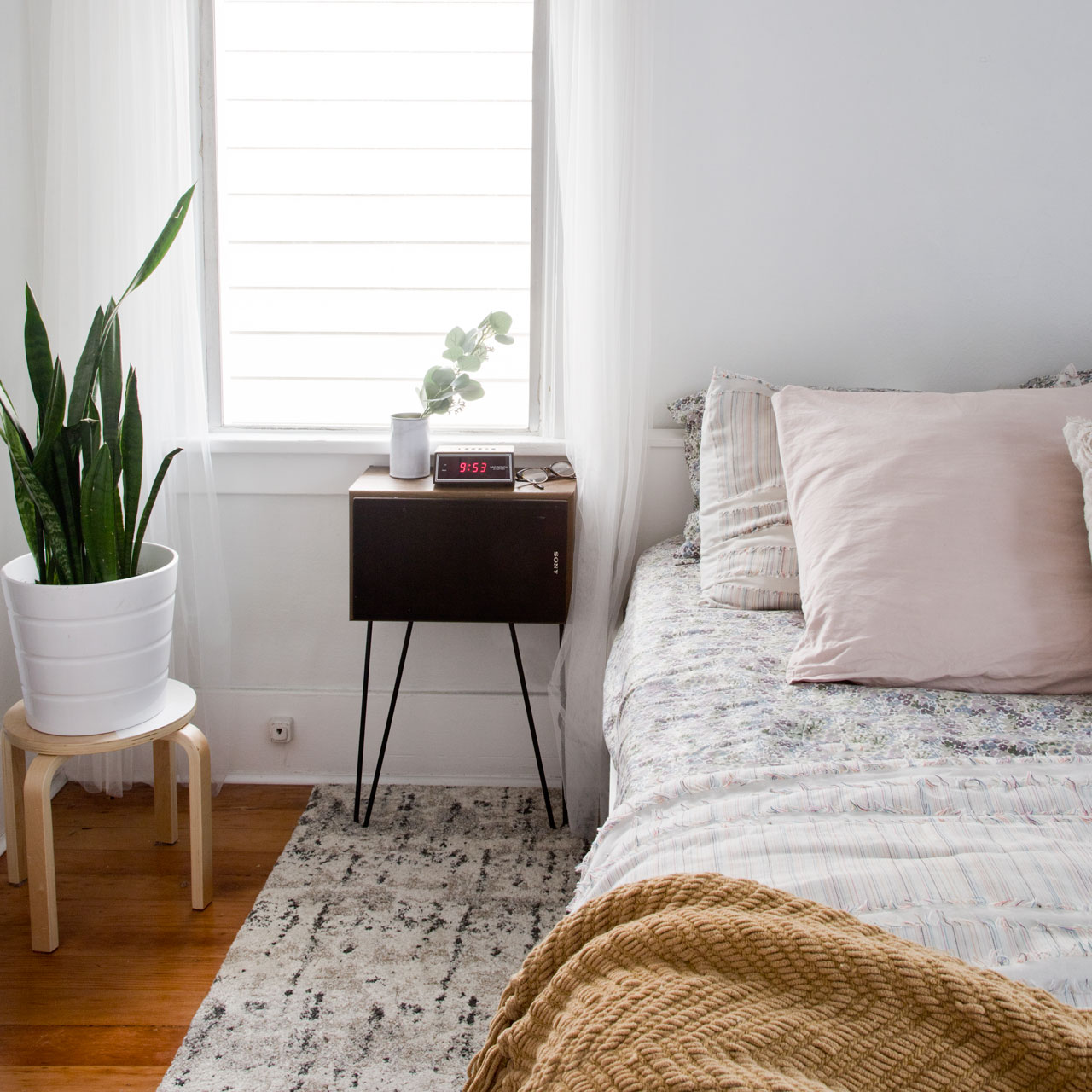
Okay, so now for the fun part. All the photos. Let me preface this by saying that I asked to keep the gallery wall and my shoe rack. I said that my number one need was clothes storage. And I described my style as minimal and boho (which I think it probably a little confusing). I also mentioned that I’m into mid century modern pieces. Yeah, I know. I sound a little crazy – I don’t know if all those things go together, but whatever. Here is what the bedroom currently looks like.

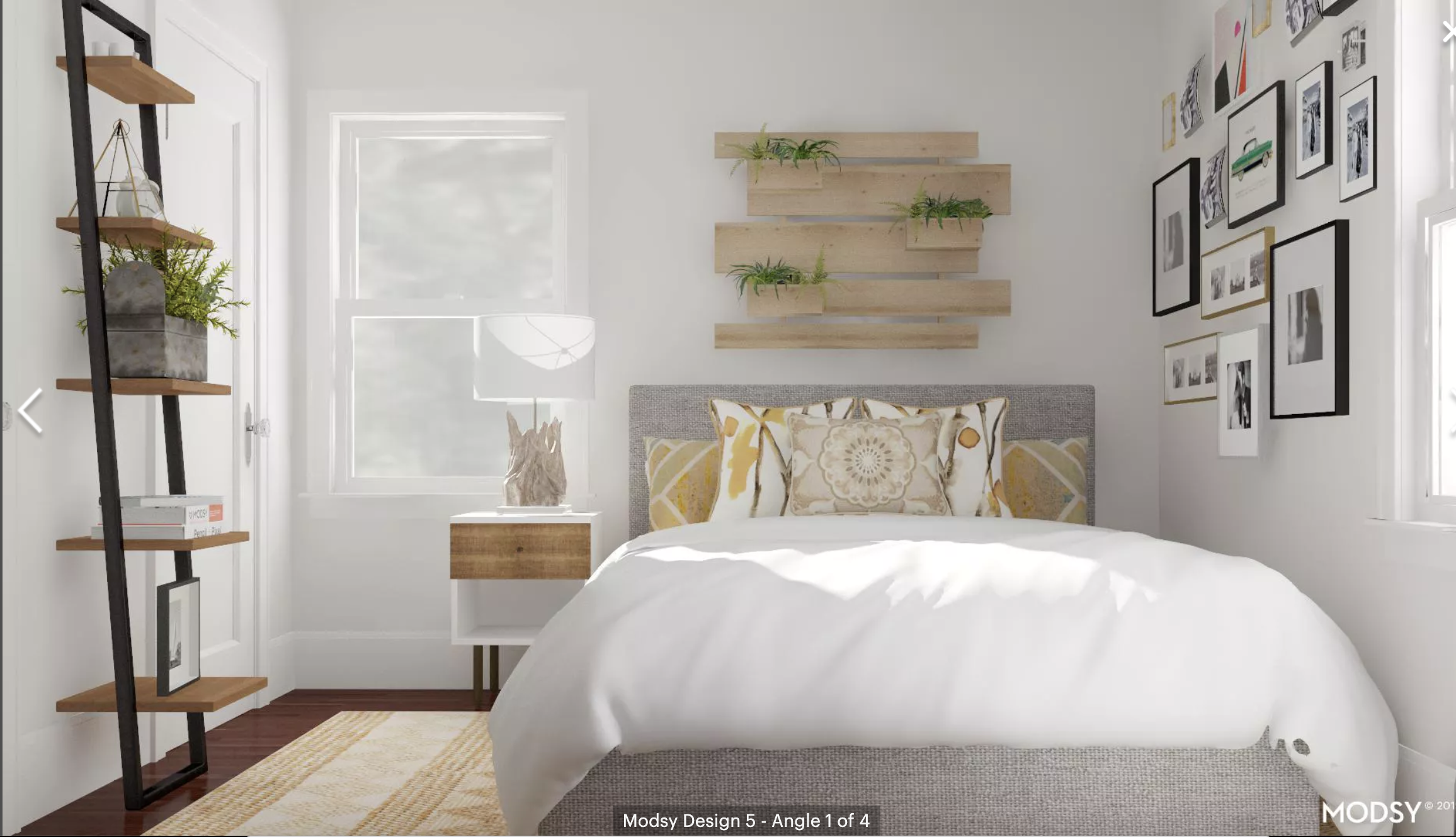
Here is the first design that they completed. 

I would give this a C. The gallery wall looks nothing like mine, there is absolutely no clothing storage, and I’m not a fan of the flower painting. It feels very much like something I would find on discount at Ross (no offense to Ross shoppers – I shop there sometimes too). I don’t really love the mirror over the bed either. Also, my shoe rack didn’t make the cut. My final complaint is that the email they sent me said, “We had so much fun creating your Chic Collectors entry space!” Huh? This is a bedroom, not a entry space. And I have no clue what Chic Collectors means. I think this was clearly an oversight, which just made the whole thing feel a little more corporate and less personalized.
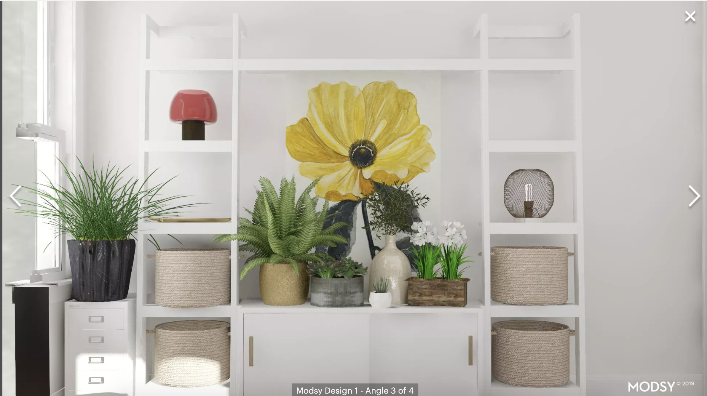
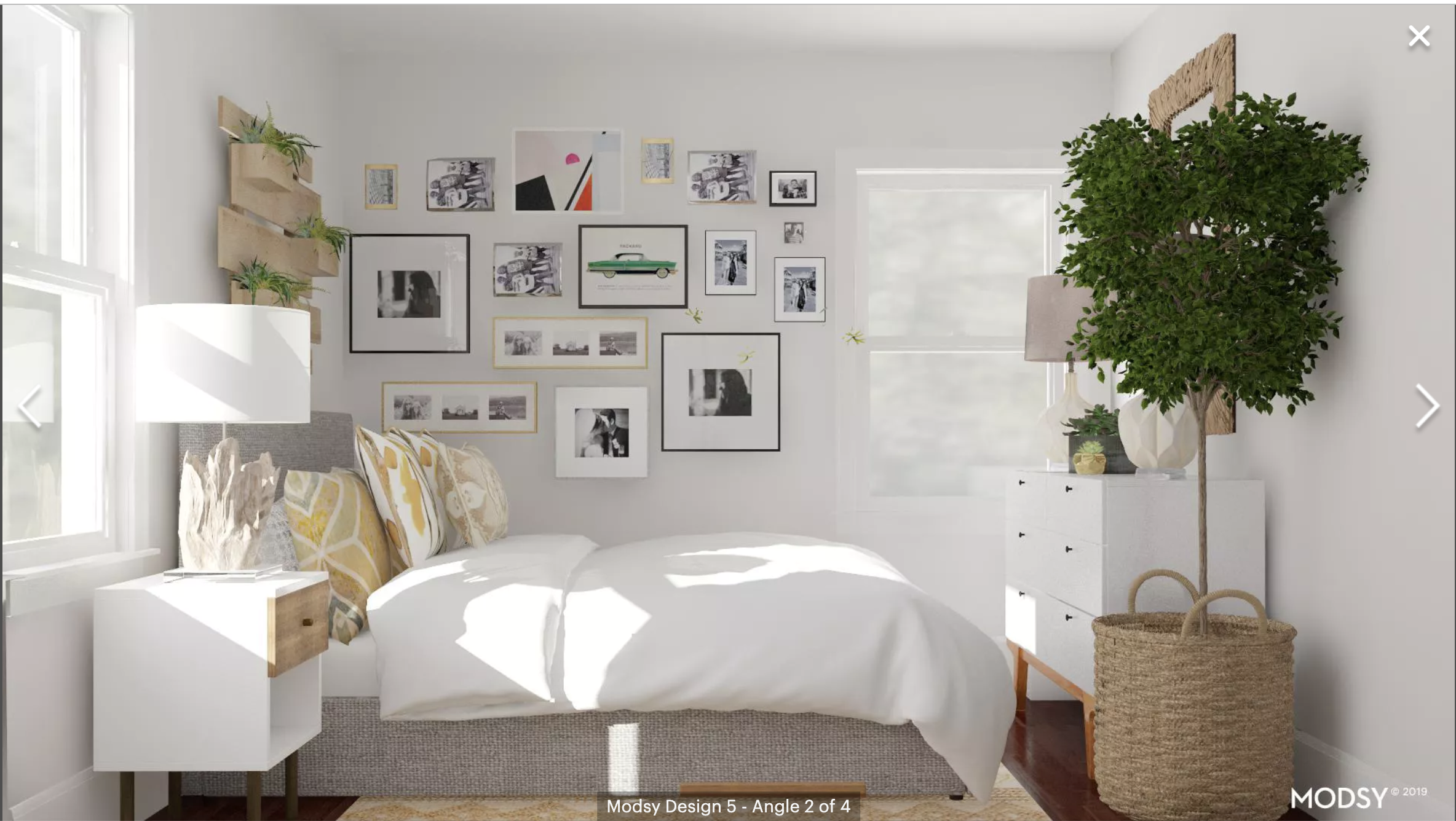
Here is the second design, which was delivered at the same time as the first one.

 I would also give this a C. It would have gotten a D if there wasn’t a cool tapestry. The hatred that I feel for the photo above the bed is unreal. Also, most of the same complaints as the first design in terms of clothing storage, gallery wall, etc. However, the tapestry by the media unit is so amazing. I really, really love it. So yay for that.I also like how they styled the media console.
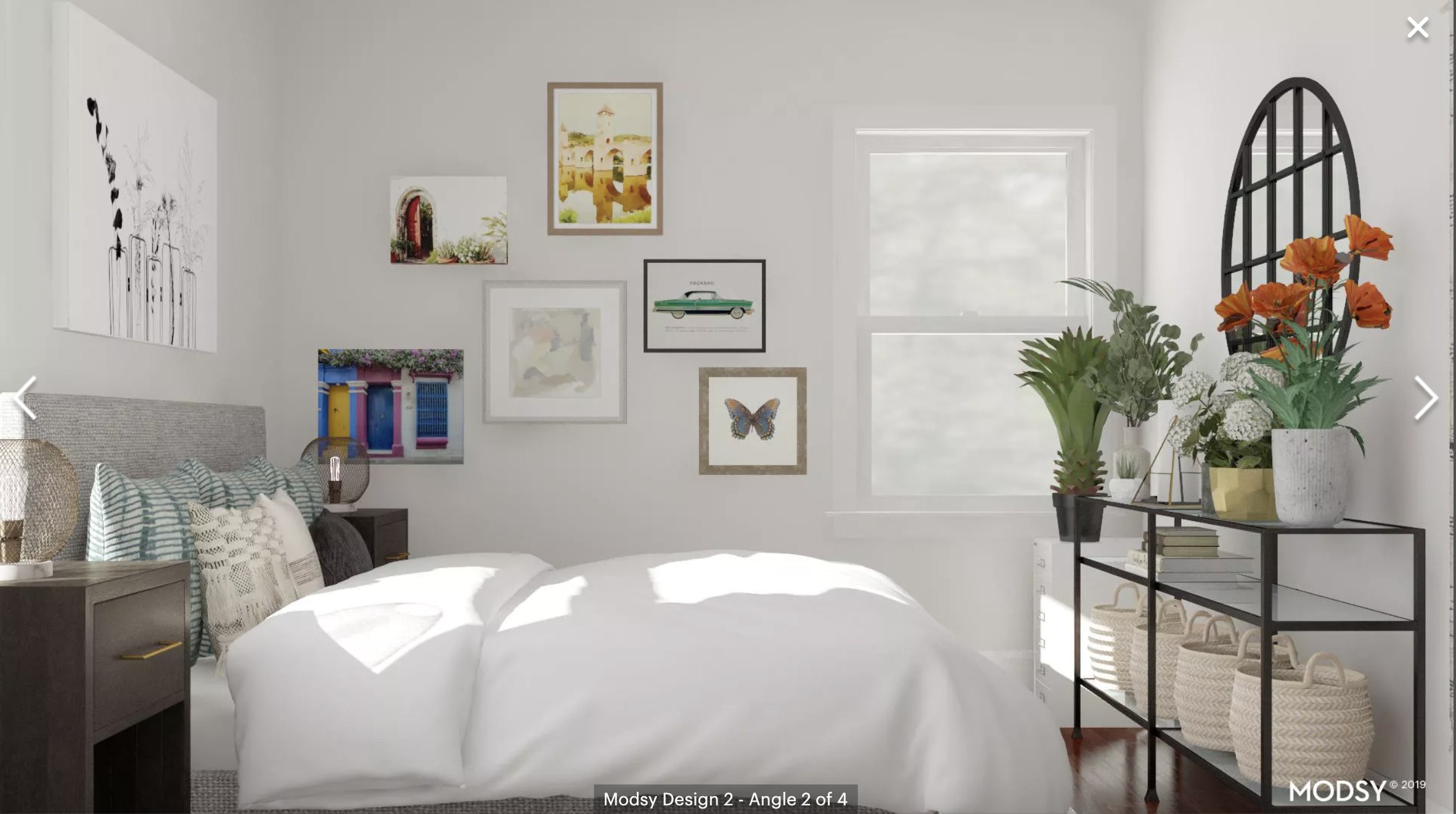
The first two designs were disappointing, so I asked for a redesign and clarified a few things. Particularly that the gallery wall looked nothing like what my photos showed. I also said that they could rearrange the furniture and I asked for some clothing storage. The design they came back with was a little better.
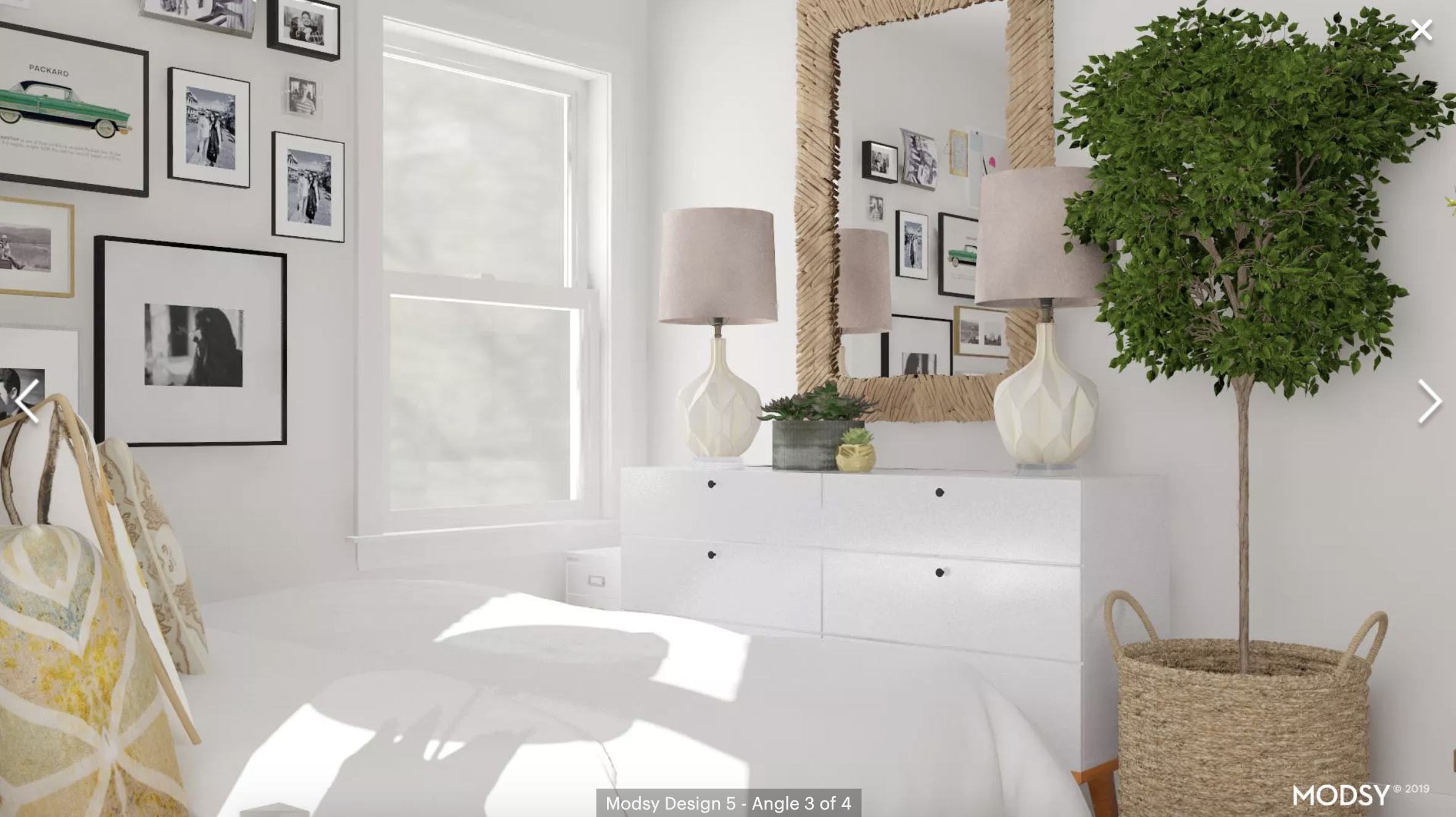
I don’t love everything, but it was the best out of the 3. So I’d say it’s a B. I think the things that I disliked most were the pillows on the bed. They just aren’t my style whatsoever. And I wasn’t super into the driftwood mirror over the dresser. Also, I liked the idea of the wall planter above the bed, but in an earthquake, that would probably fall on me and kill me, so yeah, there’s that. I do like that they moved the bed closer to the wall, but that means that Joey doesn’t have a nightstand anymore and he is definitely not cool with that.
At this point, I decided to take things into my own hands. I created a new version using the 3rd design as my starting point. 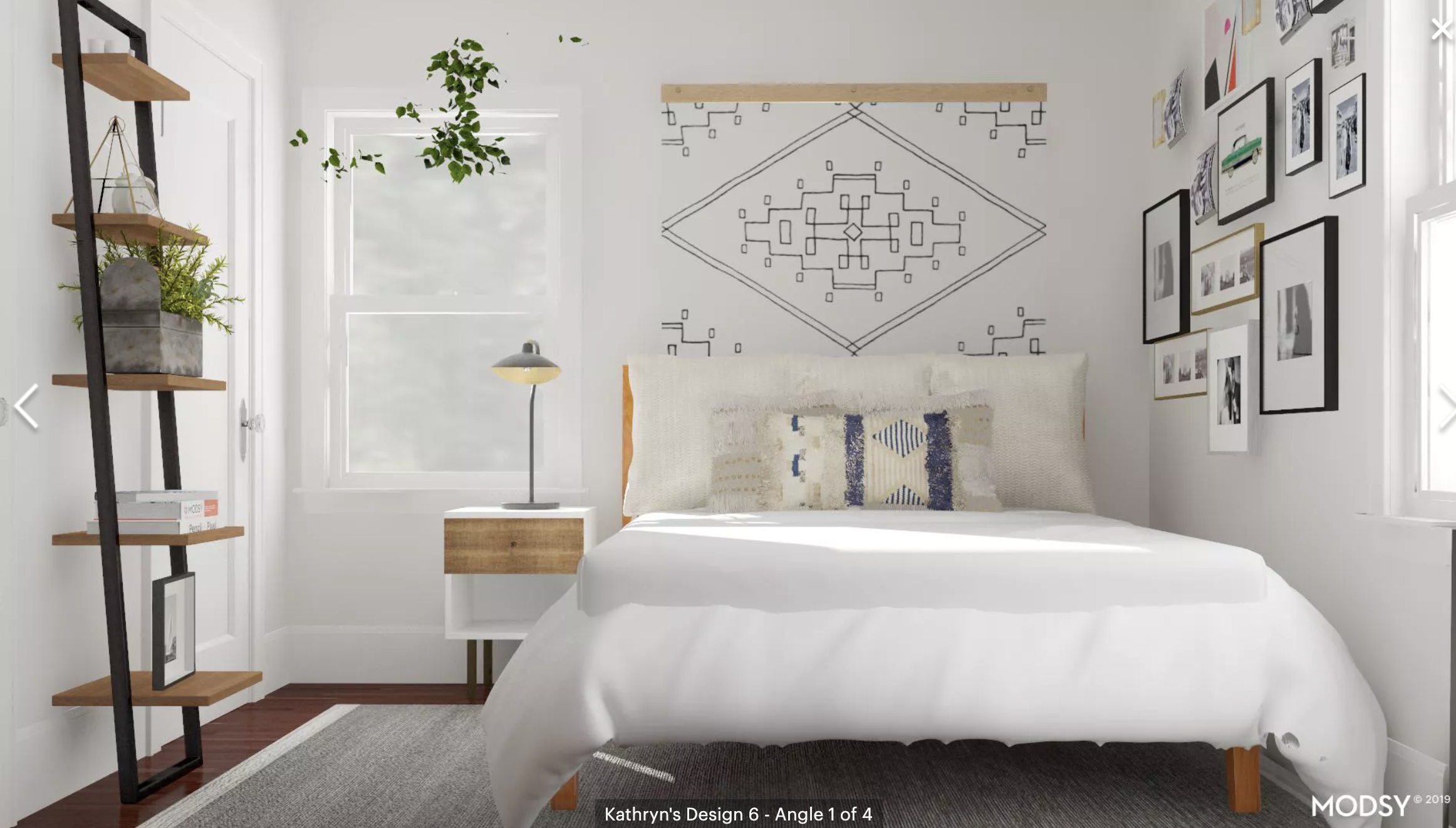
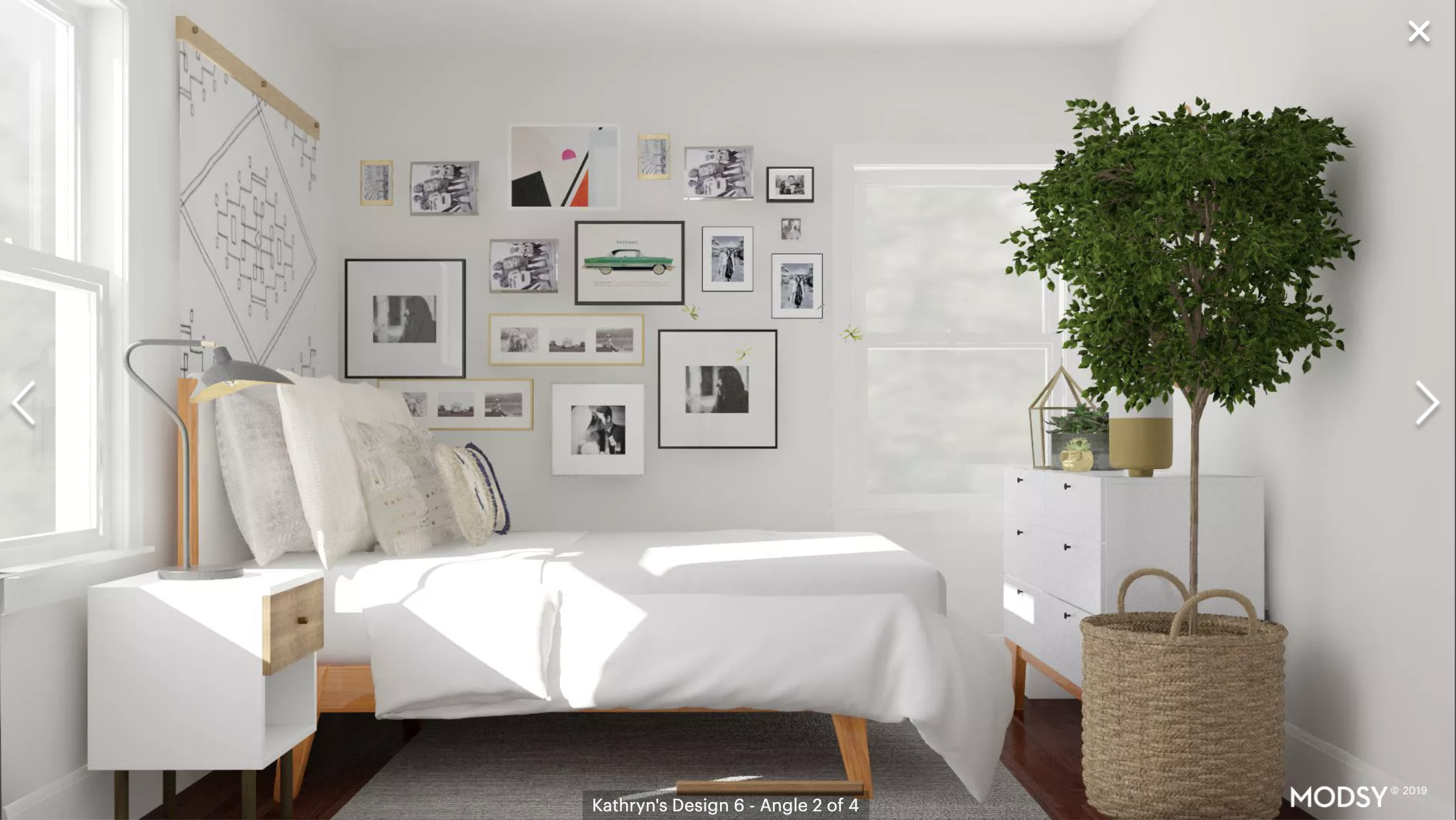
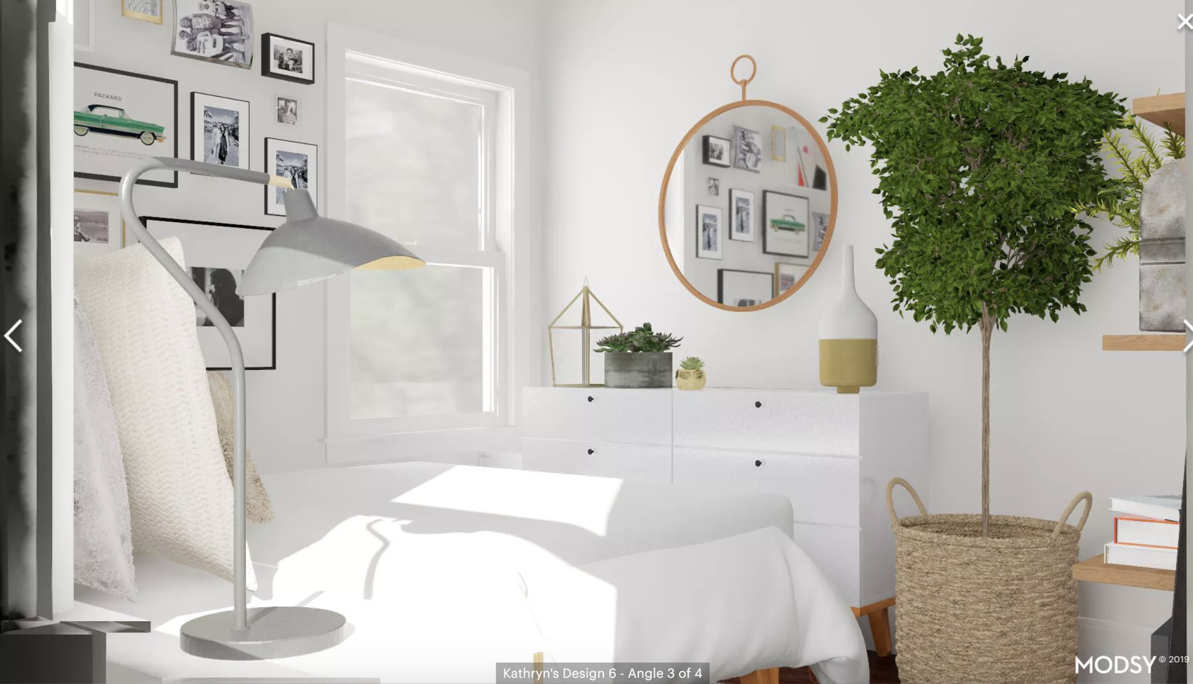
Ignore the phantom leaves in the first photo. There is a weird bug in the editor and I can’t delete it. So I switched out the bed pillows, found a decent tapestry that is likely earthquake safe, and changed a few of the decor pieces. I also found a bed frame that is way more my style. It’s not perfect, but I like it a little more than the options that the designers provided. I think I would give this design a B. I think the gallery wall does look a little weird with anything hanging over the bed, so if I were to actually turn this into reality, I would need to consider that.
So there you have it. I’m not really planning on executing on any of these changes soon. But it was fun. And honestly, I think most of the complaints that I had were my own fault. I wasn’t as clear with my style as I could have been. Have you tried Modsy yet?